Sentio
Product Design Case Study
2026
A dashboard that helps companies see how their people are actually feeling. Sentio is an employee sentiment and burnout-tracking platform, redesigned end-to-end for a confidential client that builds cloud-based tools for digitizing enterprise operations. Employees log a quick daily mood check-in, and that signal rolls up into real-time dashboards for HR teams and leadership — surfacing burnout risk, participation, and sentiment trends across offices, departments and teams.
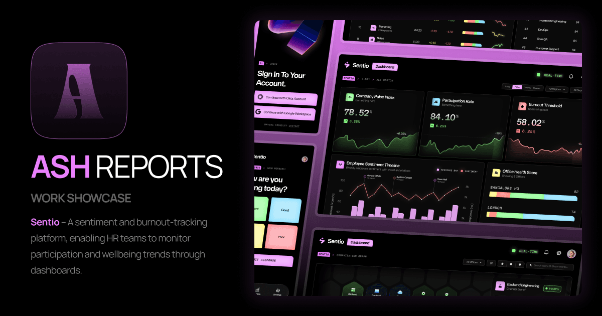
Sentio Overview
- ROLE
- Solo Product Designer
(UX + UI) - TIMELINE
- 18 days
- TOOLS
- Figma
- DEV PLATFORM
- Flutter + React
| ROLE | TIMELINE | TOOLS | DEV PLATFORM |
|---|---|---|---|
| Solo Product Designer (UX + UI) | 18 days | Figma | Flutter + React |
Who it's for
- Employees — a 10-second daily mood check-in
- HR / People Ops — participation, sentiment trends, department health
- Leadership — org-wide burnout threshold and office health scores
Confidentiality note
This project was built for a real client in the enterprise low-code/workflow space, under NDA. The name Sentio, the visual direction and all identifying details in this case study are disguised recreations — the underlying problem, flows and design decisions reflect the actual work.
The Problem
Companies had no structured way to see morale or burnout coming.
The client had no reliable, ongoing signal for employee wellbeing. Sentiment was picked up informally — through one-off surveys, manager check-ins, or exit interviews — by which point burnout or disengagement had often already taken hold. There was no single place where HR or leadership could see how people were feeling, spot patterns early, or act before it became a retention problem.
- No daily or weekly pulse on how employees are actually feeling
- Data scattered across surveys and spreadsheets, with no central dashboard
- No way to compare sentiment across offices, departments or teams
- Existing internal tool was dense with avatars and cards, but light on real insight
Approach
I worked from a mix of client research and a product brief. Rather than treating this as a visual refresh, the goal was to rebuild the product around one core question: at a glance, how is this person / team / office actually doing — and where does someone need to step in?
The original product leaned on a light, blue-toned interface with illustrated avatars and generic motivational copy — friendly, but not built to surface data. I redesigned the entire system around a dark, focused UI purpose-built for reading trends, comparing groups, and spotting risk quickly — reserving color strictly for meaning (green/blue/yellow/red sentiment states) rather than decoration.
The Tension
Clutter-free vs. more context
The client's brief pushed the other way on the daily check-in screen — they wanted more shown at that moment: team averages, streaks, comparisons, reasoning that extra context would make the check-in feel more meaningful. I disagreed. A daily habit doesn't survive the moment it starts to feel like a form.
To settle it rather than argue it, I ran informal usability sessions with 12 people — a mix of teachers, students and family — testing a data-richer version of the check-in against a stripped-down one: four large mood buttons, one screen, no scroll, no extra metrics. All 12 preferred the stripped-down version; several said outright they wouldn't complete it daily if it looked "like a survey." That feedback became the case for a genuinely clutter-free check-in, with every bit of context moved out to the separate Insights screen instead.
Early explorations
The two directions tested head-to-head: the client's original ask on the left (streak counter, sentiment number, a chart baked right into the check-in), and the stripped-down direction on the right that actually won after testing.
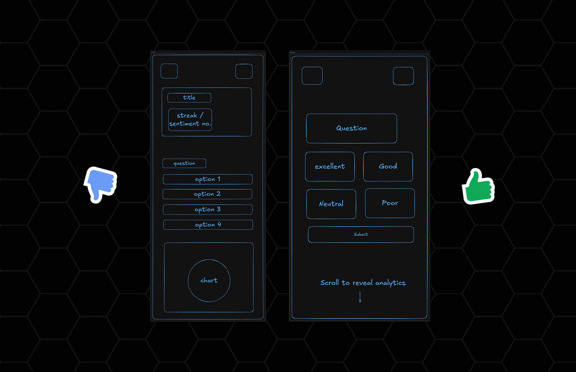
Early Explorations - Client's ask (data-rich) vs Winning direction (clutter-free)
User Flow
From sign-in to insight in three screens.
The employee-facing flow was designed to be fast and frictionless — SSO sign-in, a one-tap daily mood check-in, then a personal monthly insights view showing patterns over time.
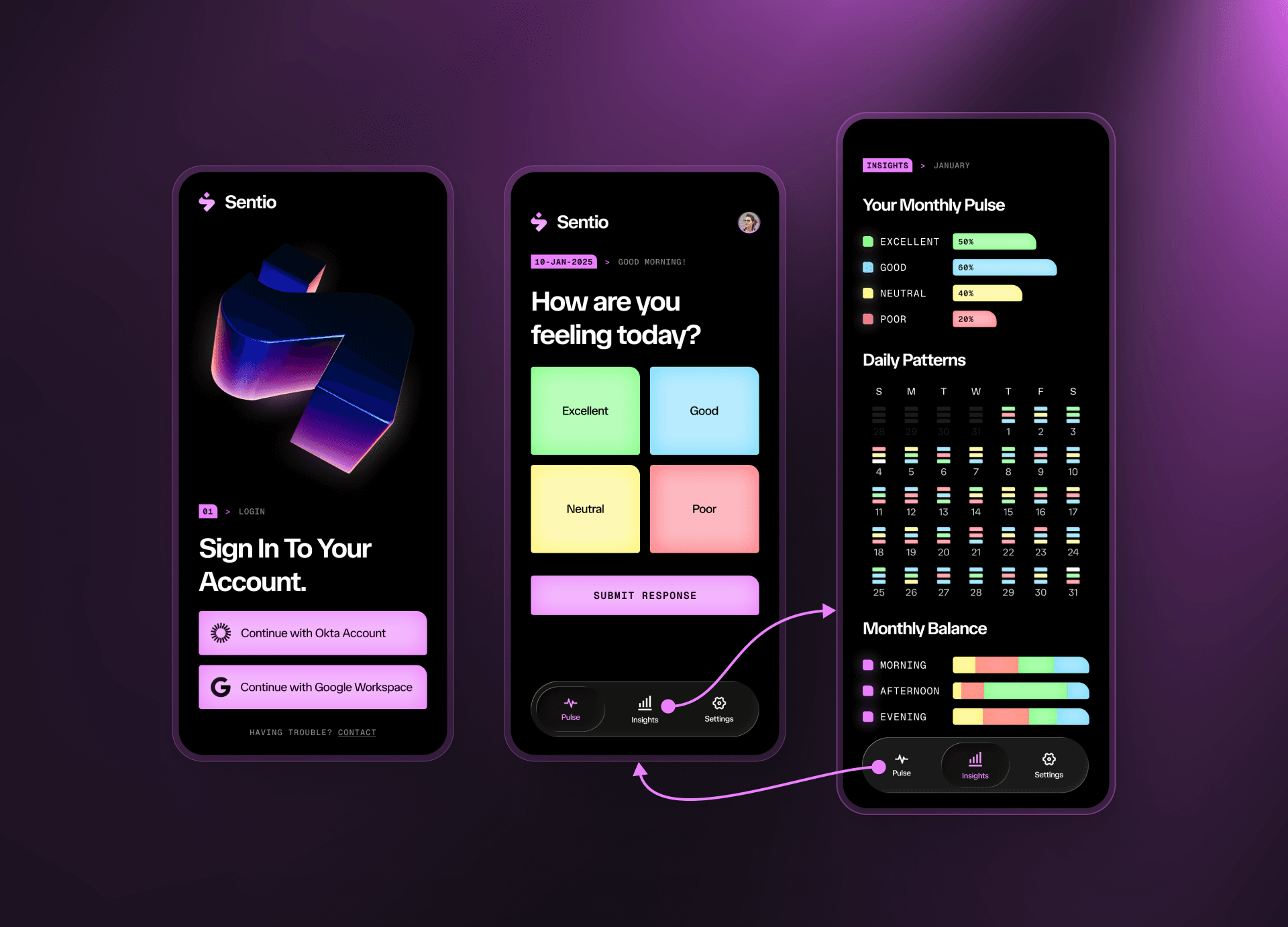
User Flow - Enterprise SSO to Today's Pulse and Insights
- Enterprise SSO — Okta / Google Workspace login, zero new credentials to manage
- Today's Pulse — one-tap mood check-in (Excellent / Good / Neutral / Poor)
- Insights — monthly pulse breakdown, daily patterns calendar, morning/afternoon/evening balance
Key Screens
Designed for scanning, not reading.
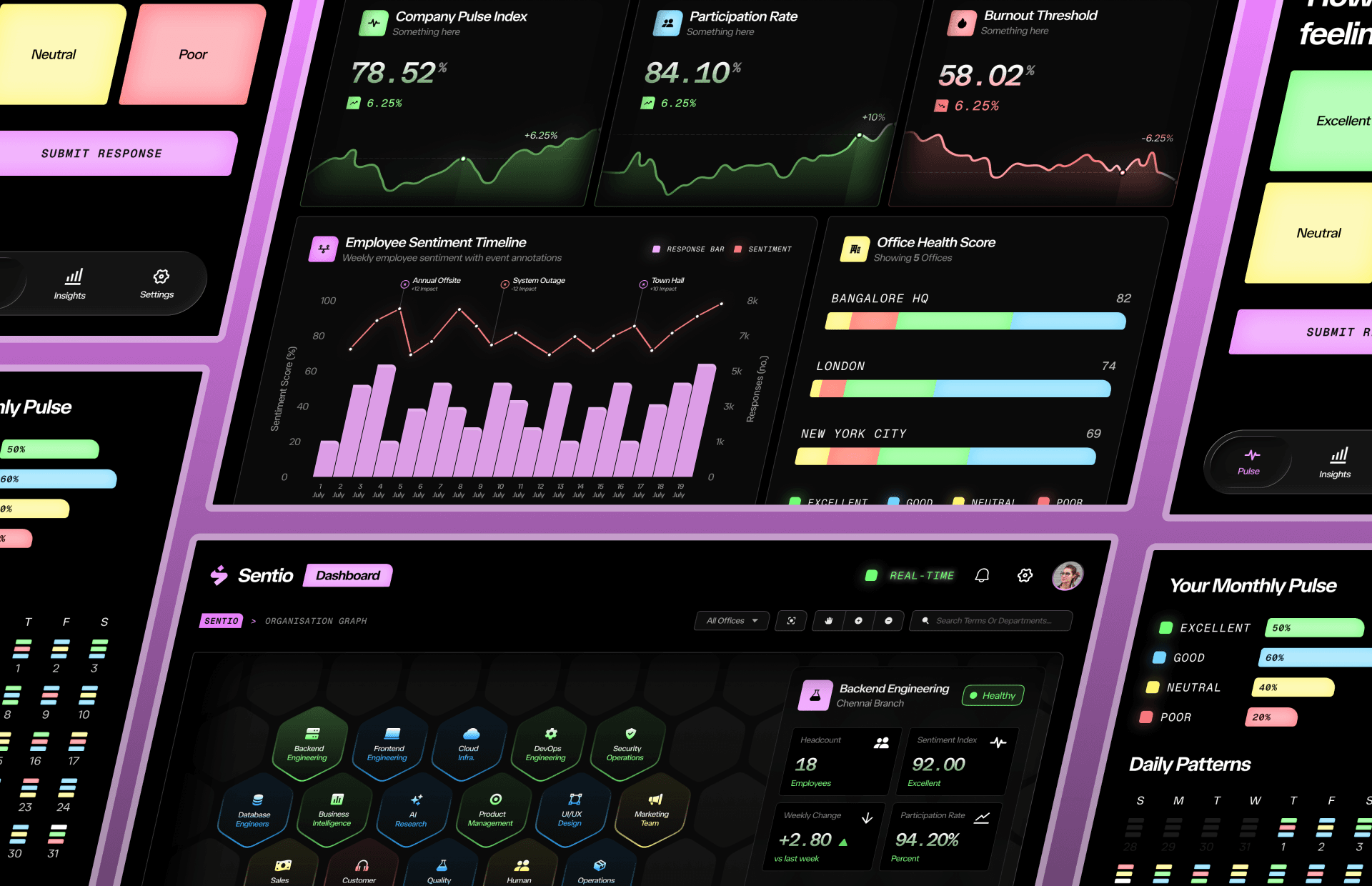
Every dashboard follows the same logic: lead with the number, support it with a trend, and use color only to mean something (excellent / good / neutral / poor). The employee-facing screens stay minimal and warm; the HR and leadership dashboards get denser as the audience needs more context per glance.
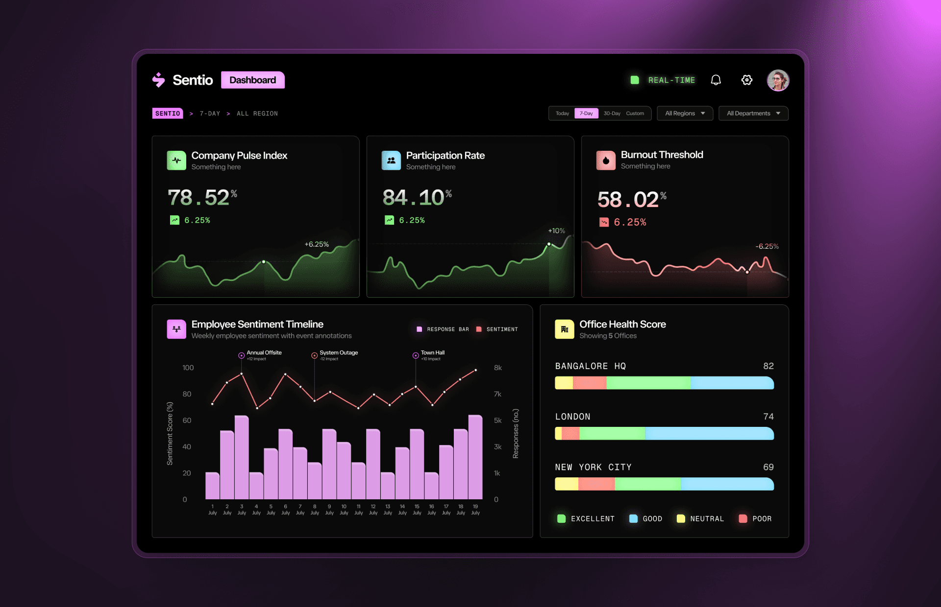
Key Screens - Sign-in, daily check-in, monthly insights, and dashboard overview
Department analytics & organisation graph
The department view ranks teams by pulse index with sparkline trends, while the organisation graph turns the entire company into a navigable hex-map — each cell a team, colored and sized by health so leadership can spot a struggling group without opening a single report.
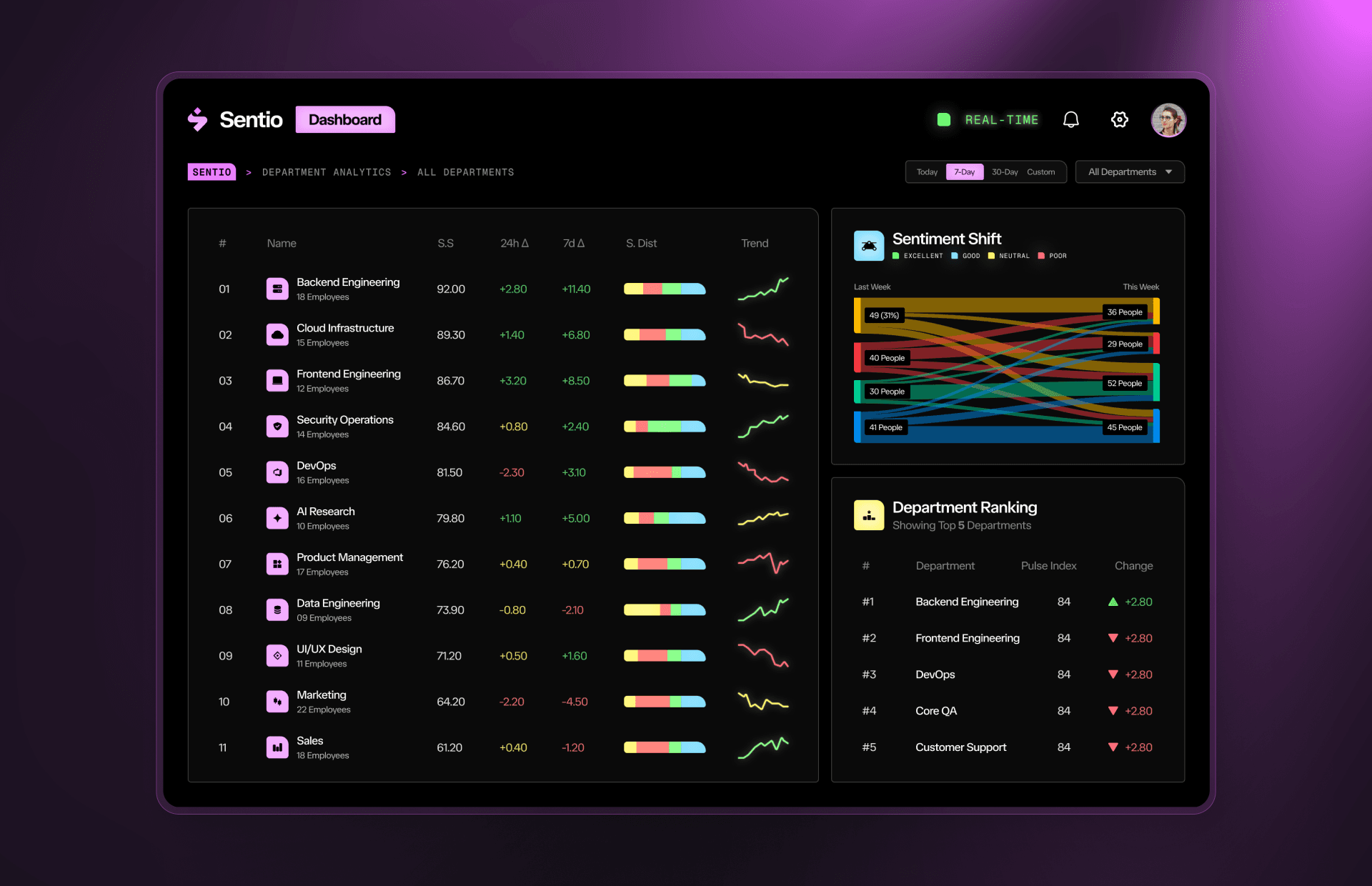
Department Analytics
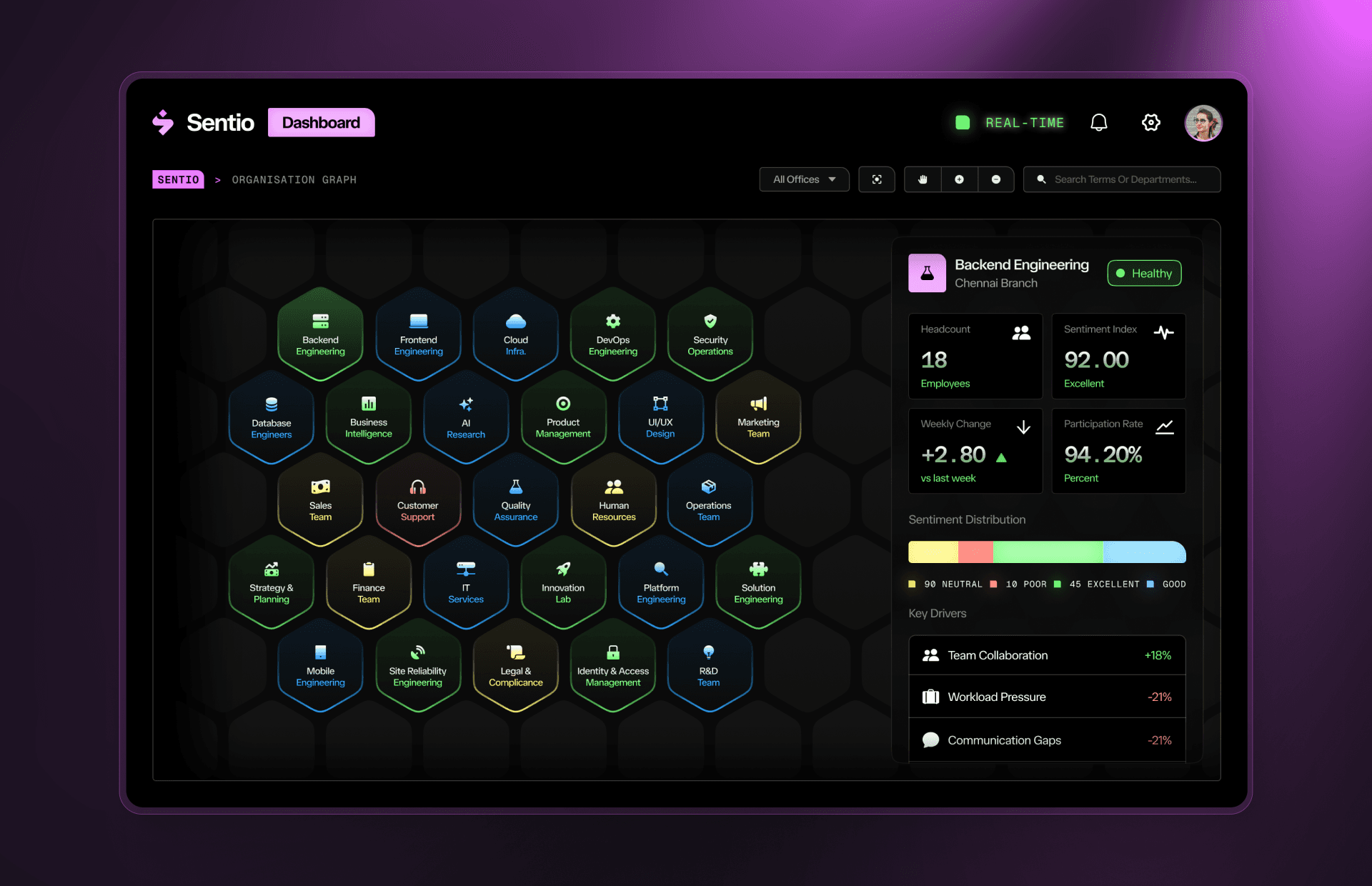
Organisation Graph
Design Decisions
The real problem was making density feel calm.
The hardest part of this project wasn't any single screen — it was deciding how to show a lot of sentiment data (daily, weekly, monthly, per-office, per-department) without turning the dashboard into a wall of numbers. Three visualizations carry most of that weight:
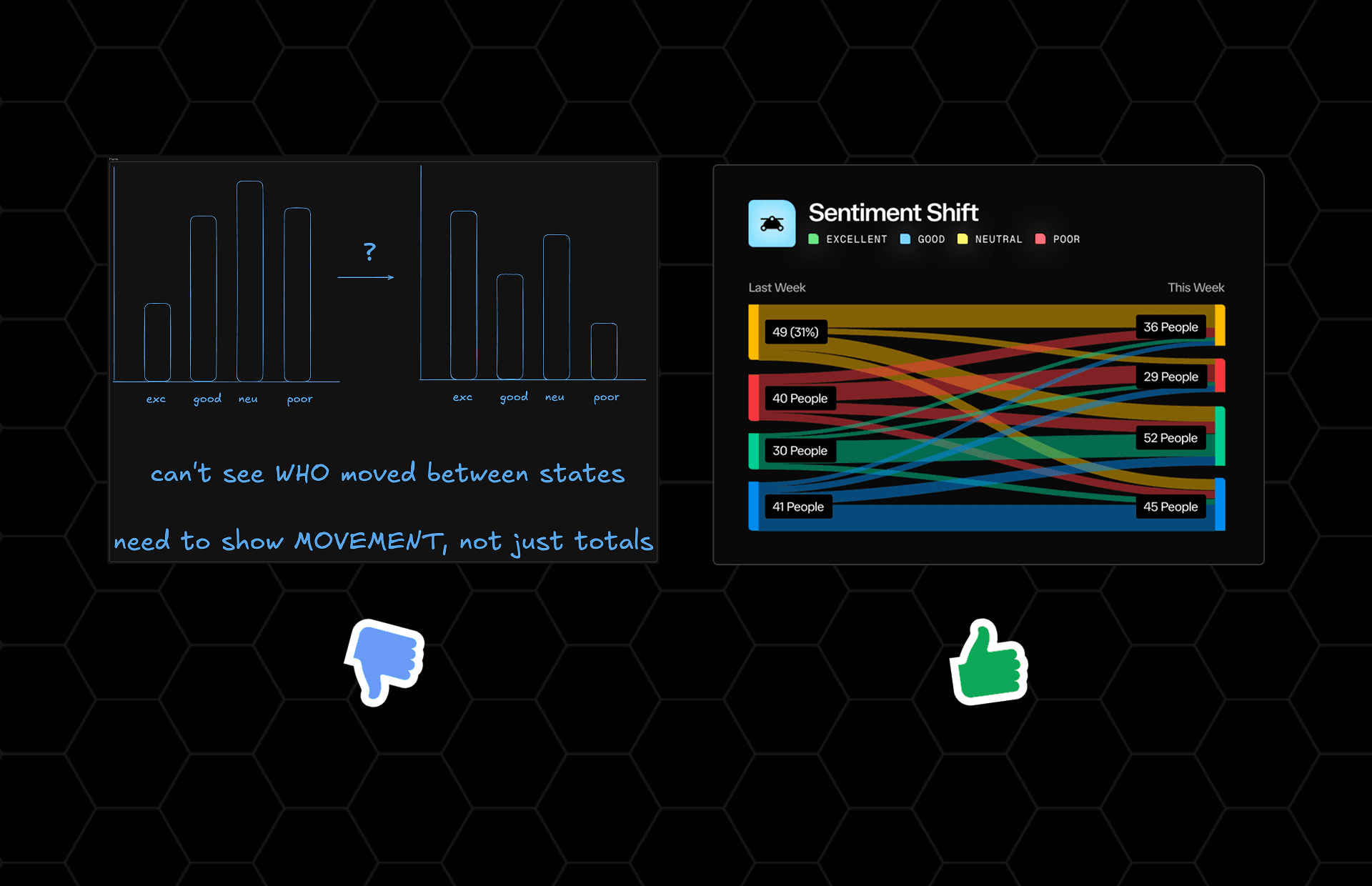
1. Sentiment Shift — Sankey diagram
Tracking how people move between sentiment states week over week (Excellent → Good, Good → Neutral, etc.) is inherently a flow problem. A Sankey diagram made the movement visible in one shape instead of forcing HR to compare two separate bar charts and do the subtraction themselves.
Sentiment Shift - Sankey Diagram
2. Organisation Graph — hexagon map
A flat list of 30+ teams doesn't communicate structure or scale. The hex-grid mirrors how the org actually nests — team, department, office — while color-coding health status, so leadership can scan the whole company the way you'd scan a heat map, not a spreadsheet.
3. Daily Patterns — calendar heatmap
For a full month of daily check-ins, a calendar grid was the only layout that kept the date meaningful. Stacked mini sentiment bars per day let someone spot "which days tend to run rough" (e.g. Mondays) without reading a single tooltip.
The unifying rule across all three: color is never decorative. Green/blue/yellow/red always means excellent/good/neutral/poor, everywhere in the product — so once someone learns the legend once, every other screen becomes instantly readable.
Outcome
Well received, and greenlit for development.
The final designs were reviewed and approved by the client, who greenlit the project for development. As this remains an internal, closed product, hard adoption metrics aren't available to share publicly — but the design was validated directly with prospective users.
- Client approved the full design and signed off on moving to development
- Design was validated through informal usability sessions ahead of build — the flow and clarity of the check-in and insights screens were consistently the most praised parts
- Full design system, flows and prototype delivered as handoff-ready Figma files
What I'd explore next
The usability sessions that settled the clutter-free check-in were informal and small-scale — 12 people in one round. Given more time, I'd want to validate that decision at scale across a larger, more diverse group, and pair it with real longitudinal check-in data to see whether the burnout threshold indicator still holds up over months, not just an 18-day sprint.
Sentio Final Collage