A charity dog-food brand's website that undersold its own cause. Ragnour is a non-profit that sells dog food and puts the profits toward rescuing and rehoming stray puppies — a genuinely good cause let down by a website that didn't look, or function, like something worth trusting. This was a self-initiated rescue: no client, no brief, just a redesign I built and shipped hoping the brand would notice.
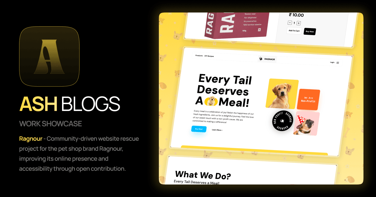
Ragnour Cover Image
| ROLE | TIMELINE | TOOLS |
|---|---|---|
| Product Designer (40%) & Front-End Developer (solo) | ~1 week | Figma · React.js · Next.js · Motion · Tailwind CSS |
How I found it
I've always enjoyed watching Sid Frequency, a YouTube channel that digs into struggling or corrupt businesses. One video led me to Ragnour — a non-profit selling dog food, using the profits to rescue and rehome abandoned and stray puppies. It's a genuinely good cause. But their website was failing to retain visitors, quietly undermining the very outreach it needed to survive.
As someone who loves dogs, this one hit different. I decided to see if I could help.
The Problem
A good cause, buried under a website that didn't earn trust.
- No brand logo — nothing for a visitor to recognize or remember
- Inconsistent formatting and a rough, unpolished UX
- Products barely visible on the home page
- Missing navigation links, making the site feel unfinished
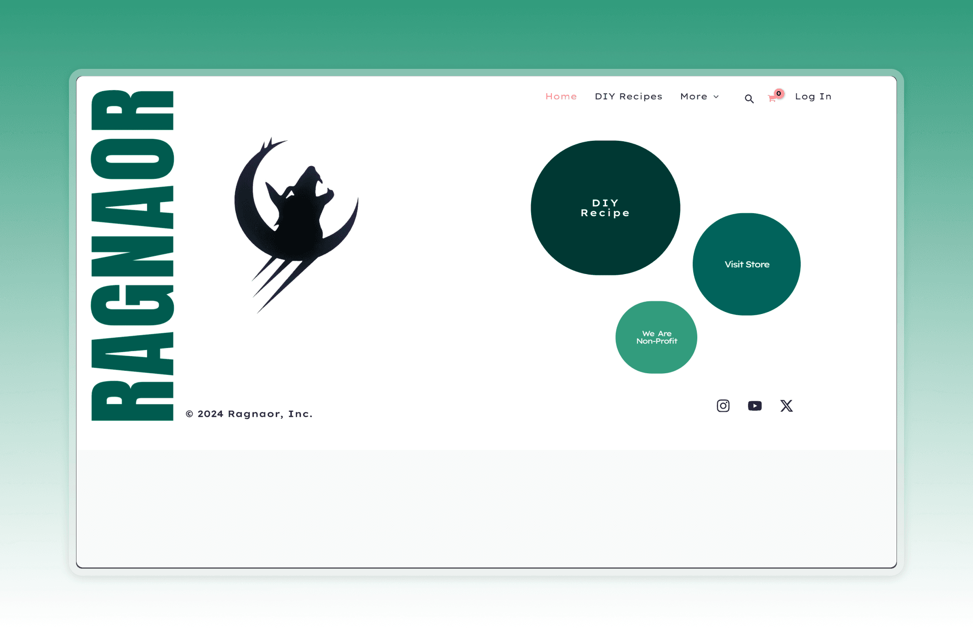
Original Ragnour Website
The Decision
Simple, attractive, and unmistakably a charity.
There wasn't a client to negotiate scope with, so the real tension was internal: how far to take it. The call I made early was to keep the redesign simple and visually clean rather than over-designed, while making sure that within seconds of landing on the page, anyone could tell this was a charitable cause, not just another pet food store. Every section from the hero down was built to carry that signal.
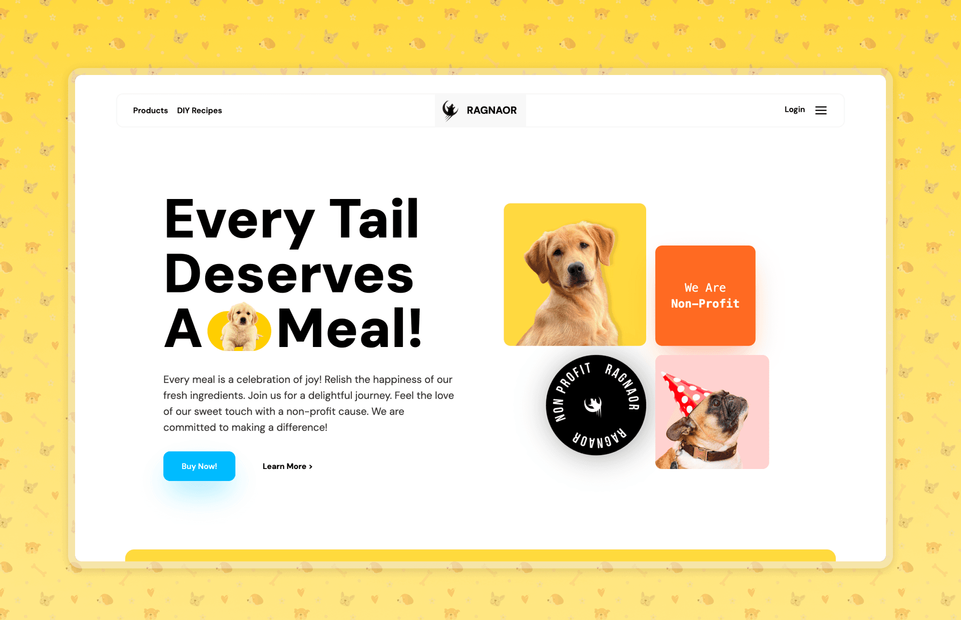
Hero Section
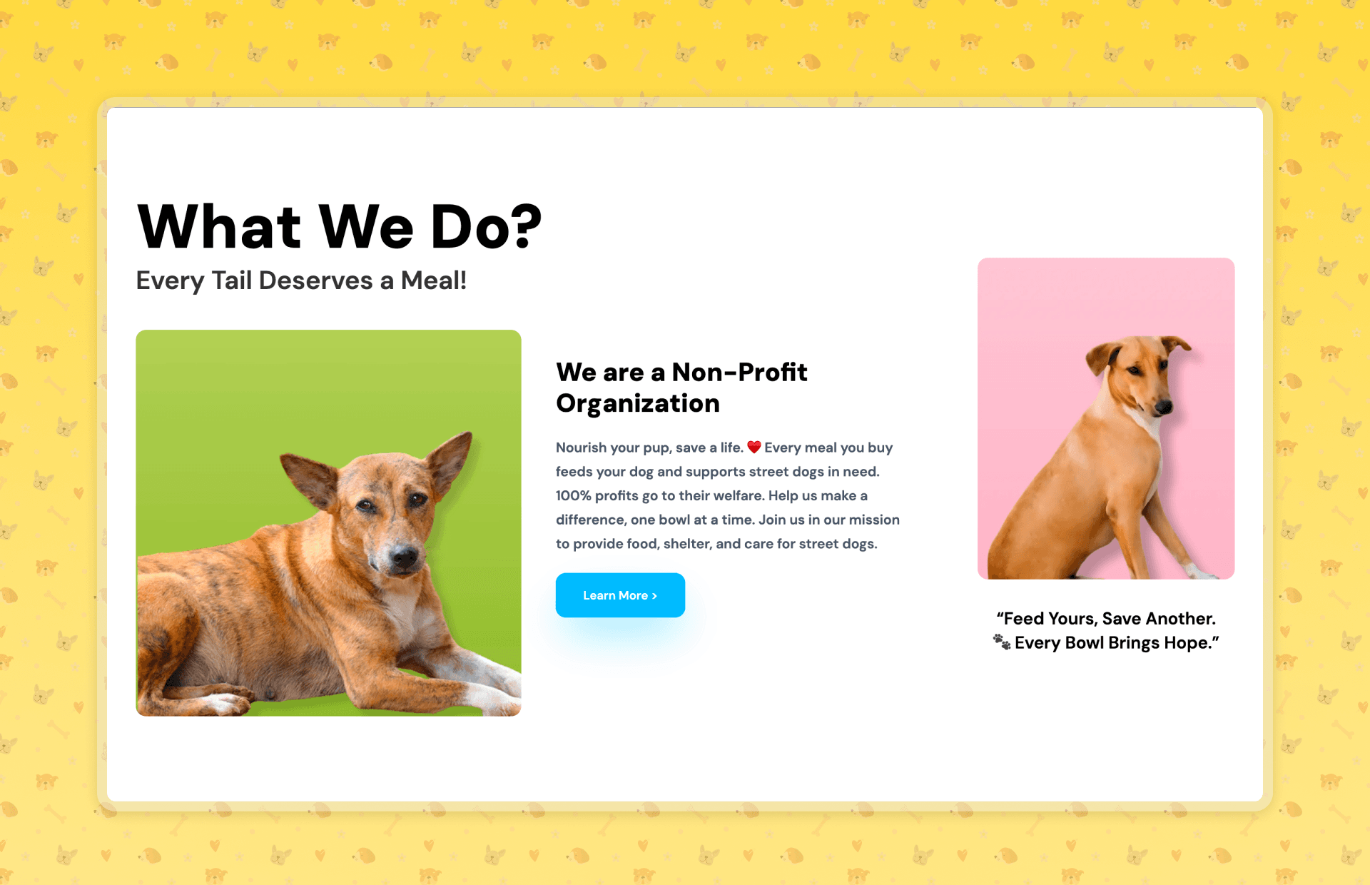
What We Do — Charity Awareness Section
Wireframing & Ideation
Before jumping straight into Figma or writing code, I mapped out the structure to establish basic UI/UX conventions. The original site lacked a standard layout, forcing users to learn a clunky navigation system just to find out how to support the cause.
I sketched out a convention-first viewport layout — a clear navbar at the top, a prominent hero section, followed immediately by features and products, and ending with a standard footer. Establishing this conventional, predictable flow was critical for making the site feel familiar and trustworthy to potential donors and buyers.
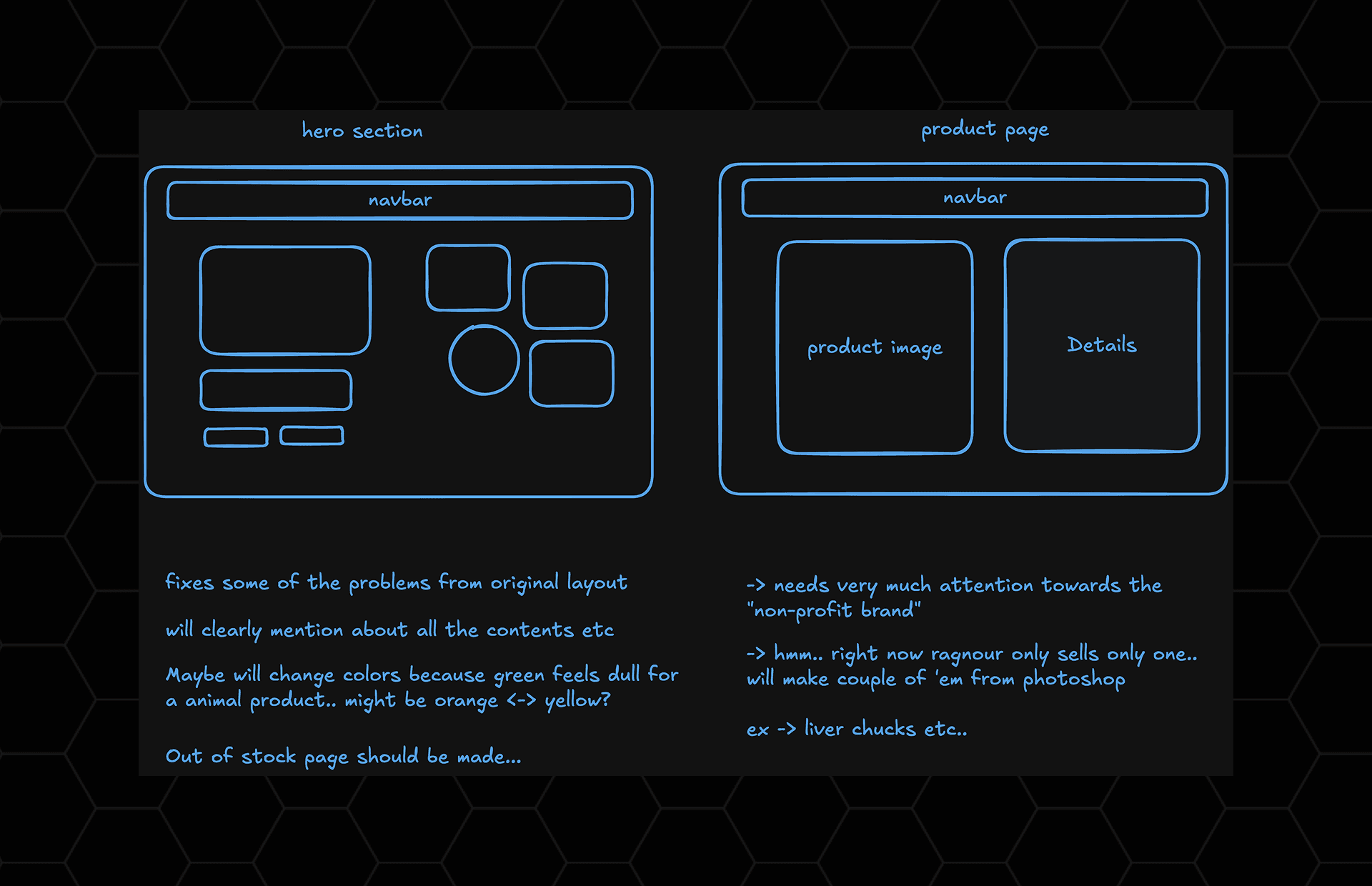
Initial Wireframes & Structural Sketches
Getting Started
This was primarily a front-end-heavy project. I designed in Figma first, then built the entire thing myself in React.js and Next.js, styled with Tailwind CSS and animated with Motion. The original site felt static, close to plain HTML/CSS — so a lot of the early work was just making it feel alive: real component state, real interactivity, a home page that actually explained the mission instead of assuming visitors already knew it.

Ragnour Tech Stack
Key Screens
From a bare landing page to a full storefront.
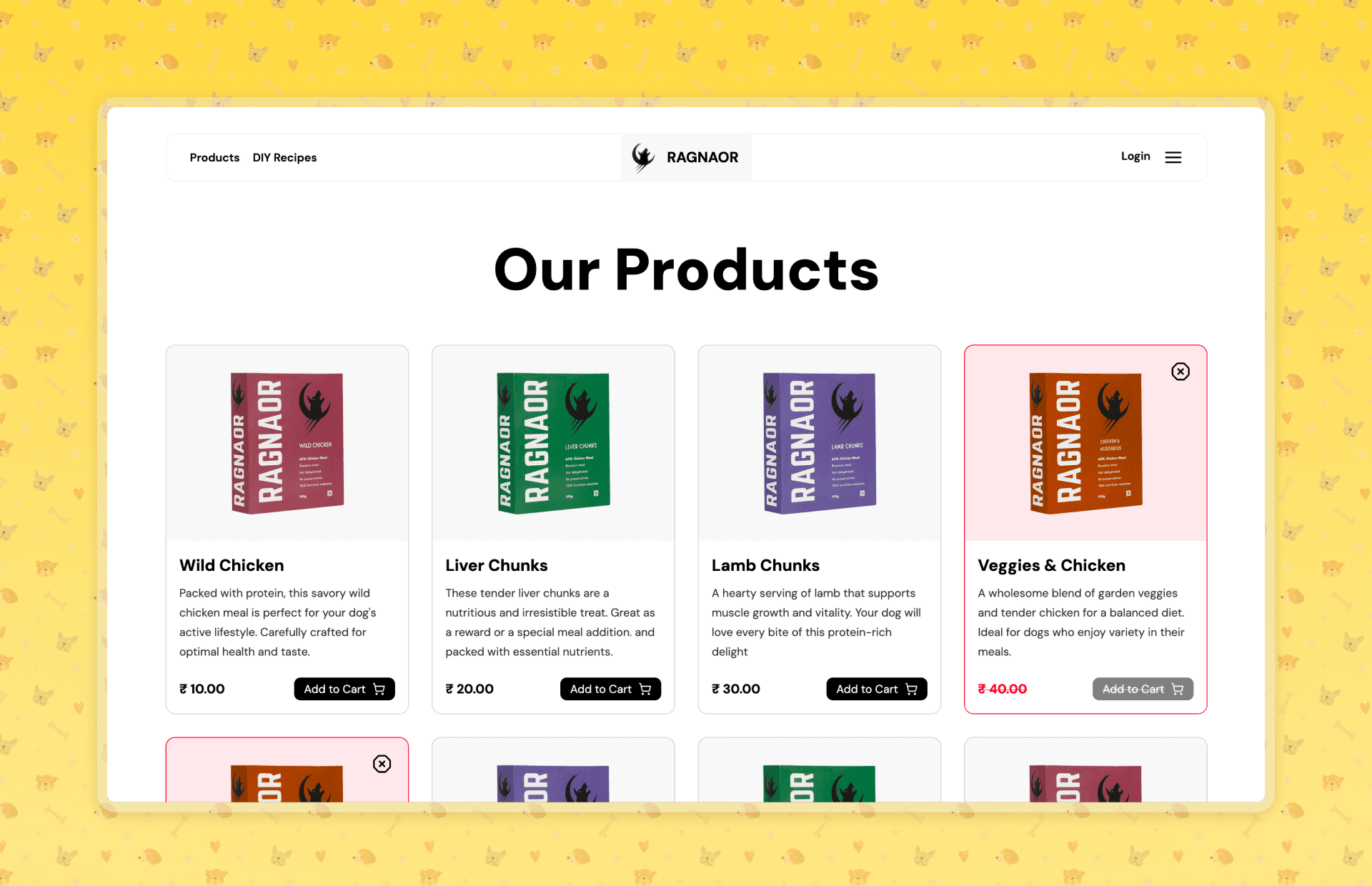
Products Page
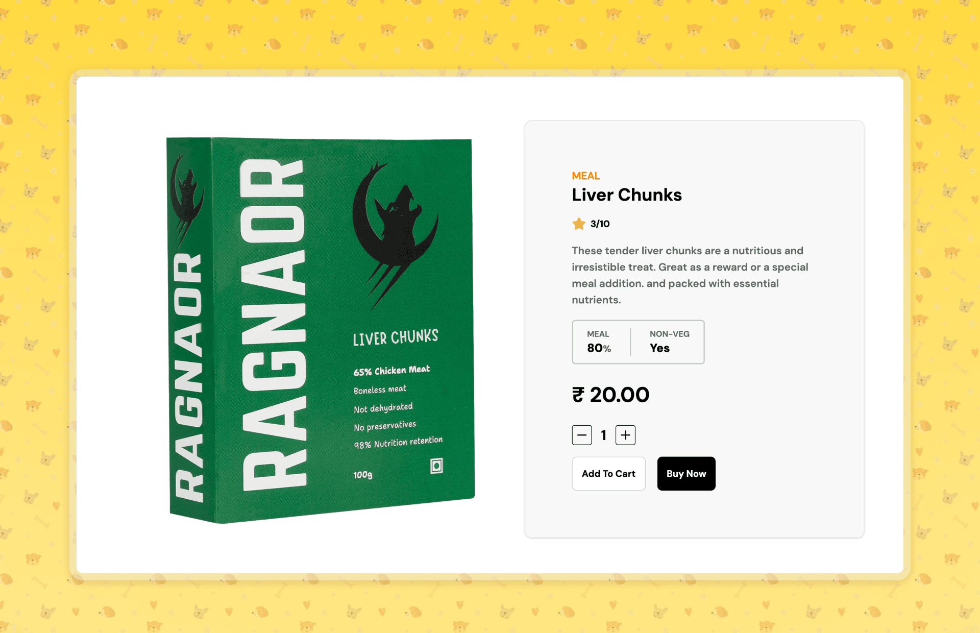
Individual Product Page
Outcome
Shipped in a week — no reply yet, but no regrets either.
I reached out to Ragnour and to Sid Frequency directly, hoping the redesign might get seen, maybe even featured. Neither responded — Sid's since grown into a bigger creator with a massive following, so the window may have just closed before it opened.
However, I documented the entire process — from dissecting the original site's UX flaws to explaining the structure and logic behind the redesign — in a YouTube video titled I Made @sidfrequency Website Much Better! You can watch the full walkthrough here:
I Made @sidfrequency Website Much Better!
- Fully functional navigation added where there was none
- A cohesive UI system replacing what was closer to plain HTML/CSS
- Critical UX issues resolved across the home, products, and product pages
- The whole project — Figma through shipped front-end — completed in about a week
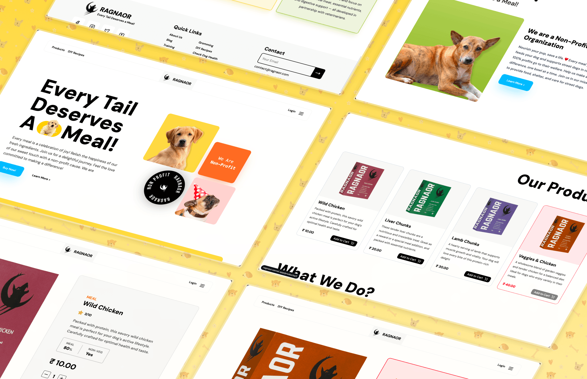
Ragnour Final Collage
Personal reflection
This project was less about the pixels and more about the jump from having designs to actually building them. I had the Figma screens ready, but doing the entire front-end myself — state, routing, multiple screen types, animation — taught me more than the design phase did. It's also worth saying: this was pre-LLM for me. Everything here was handmade, aside from some content — no AI in the loop at all.