Rydo
Product Design Case Study
2026
A booking app that treats drivers as partners, not just labor. Rydo is a rider-facing ride-hailing app, designed end-to-end as a localized alternative to Uber and Ola for South India. Riders book scooties, bikes, autos, and cars in a few taps; the app layers in fairness signals — live price bidding, driver-conduct feedback — that most competitors treat as an afterthought.
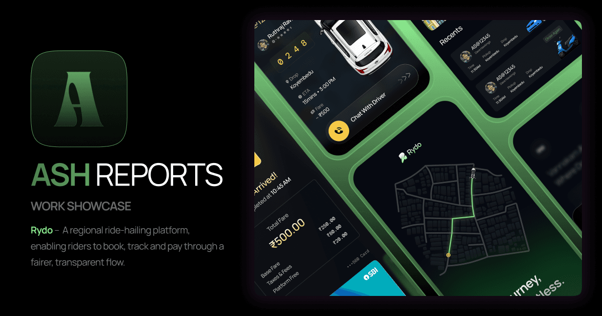
Rydo Overview
- ROLE
- Solo Product Designer
(UX + UI) - TIMELINE
- 1–2 months
- TOOLS
- Figma · Flutter
- MARKET
- South India
| ROLE | TIMELINE | TOOLS | MARKET |
|---|---|---|---|
| Solo Product Designer (UX + UI) | 1–2 months | Figma · Flutter | South India |
Part of a larger product
Rydo is planned as three connected apps. This case study covers the Riders app.
| APP | STATUS |
|---|---|
| Riders App | Complete — covered in this case study |
| Driver App | In design |
| Dashboard | Planned — operational insights |
Who it's for
- Riders — fast, familiar booking with a wider vehicle range, including women-specific ride options
- Drivers — live bid acceptance instead of forced assignment, and (via the companion Driver app, currently in design) the ability to rate riders in return — the same accountability riders already have here
Confidentiality note
This project was built for a real regional ride-hailing client, under a confidentiality agreement. The name Rydo, the visual direction, and identifying details in this case study are disguised recreations — the underlying problem, flows, and design decisions reflect the actual work.
The Problem
Existing platforms treat drivers as a back-end resource, not a stakeholder.
The client's dissatisfaction with existing ride-hailing platforms wasn't about the rider experience — it was about what those platforms leave out. Drivers get matched by opaque algorithms, rated one-directionally, and have little visible say in the ride they're taking on. The brief was to build a regional alternative where fairness runs both ways.
- No visibility into matching — riders and drivers are both handed a decision, not given a part in it
- Rider feedback exists; driver-side accountability for riders largely doesn't
- Vehicle options tend to be narrow, with little consideration for rider groups like women travelling alone
- No easy way for a rider to flag driver misconduct (e.g. cash demands) as part of the natural flow, rather than a buried support ticket
Approach
I worked from direct client conversations rather than a written spec — the client wasn't a technical or design-trained stakeholder, so requirements mostly arrived as plain, directional feedback ("something different," "I know you can figure this out") rather than documented requirements. Reading between those lines, and turning vague direction into concrete interaction decisions, was the core design challenge on this project — more so than any single screen's complexity. The dark visual direction itself was the client's own call from early on.
The Tension
Efficient matching vs. a fairer feeling
The obvious, easy build was a standard algorithmic driver match — assign silently, done. That's what most competitor apps do, and it's simpler to build and reason about. But it doesn't reflect the client's actual goal: giving both sides of the ride real agency, not just an outcome. The resolution was a live price-bidding flow, where the fare visibly adjusts and drivers actively accept, rather than get silently assigned — trading a small amount of simplicity for a flow that actually shows fairness happening, rather than just claiming it.
User Flow
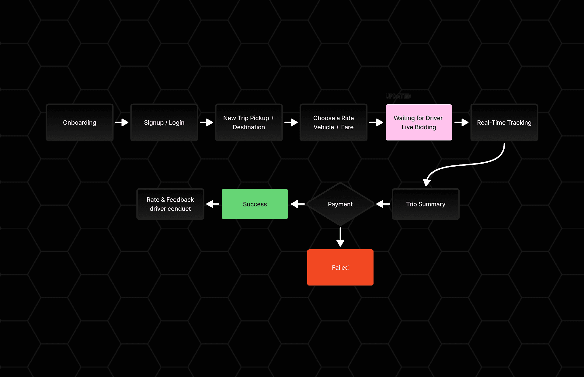
Rider journey — onboarding to a rated ride.
The rider-facing flow moves from account setup to booking to a transparent matching moment, then live tracking and payment — with driver-conduct feedback folded into the natural end of the trip rather than a separate flow.
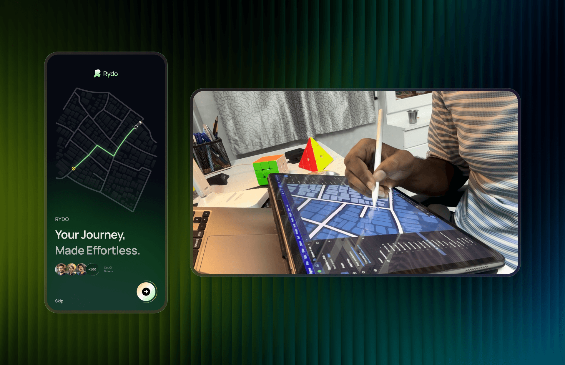
Onboarding screen & behind-the-scenes snapshot of creating the iPad illustration
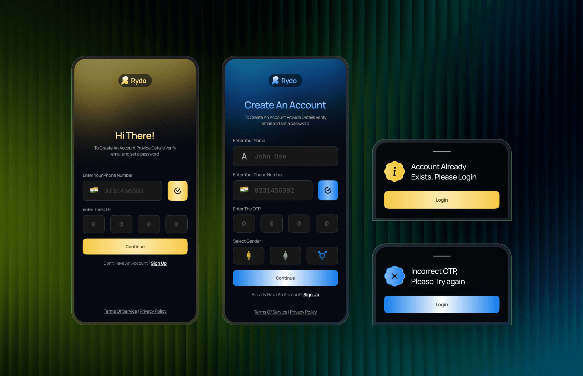
Authentication Screens
Key Screens
Designed to feel like a conversation, not a form.
The full vehicle range on the ride selection screen is intentionally wide — Scooty, Bike, EV Bike, Women's EV Bike, Women's Bike, Standard, Sedan, SUV, and Auto — a broader and more inclusive set than typical competitor offerings.
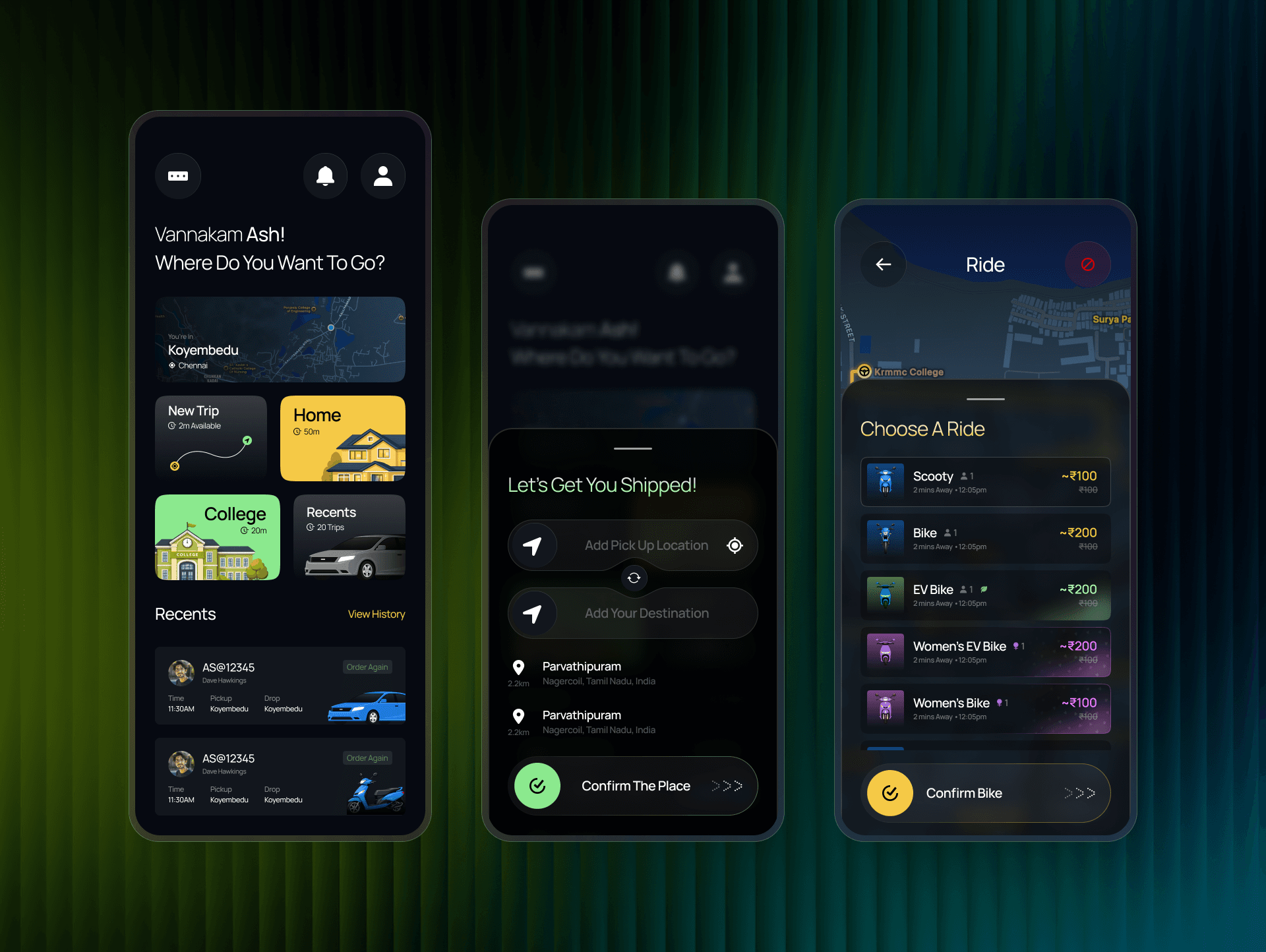
Home, New Ride & Vehicle Selection Screens
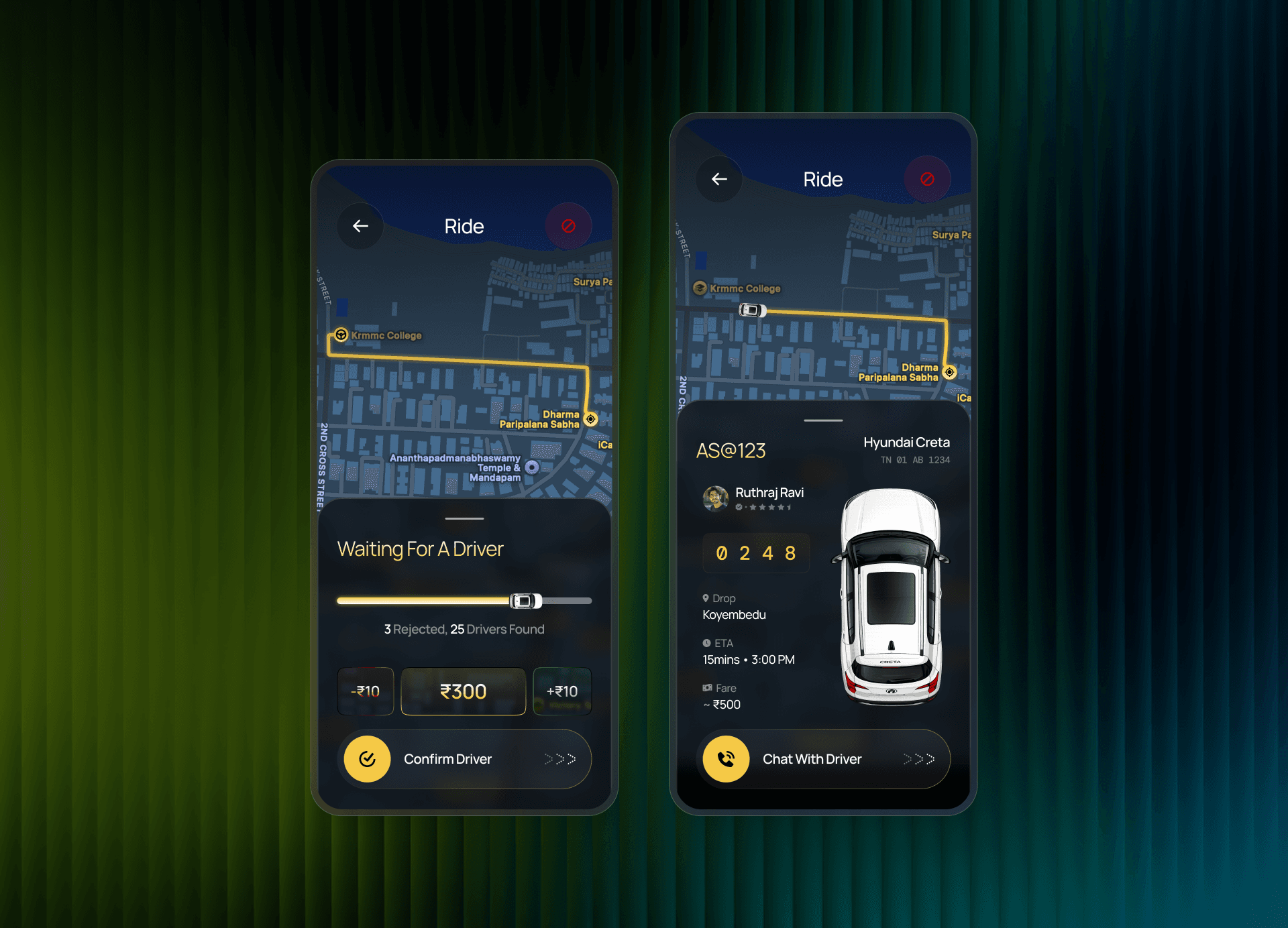
Waiting for a Driver — Live Bidding & Real-Time Tracking
Driver-conduct feedback ("Did the Driver Ask Extra Cash?") is folded directly into the post-payment screen — a small placement decision that keeps accountability part of the natural flow instead of a separate report.
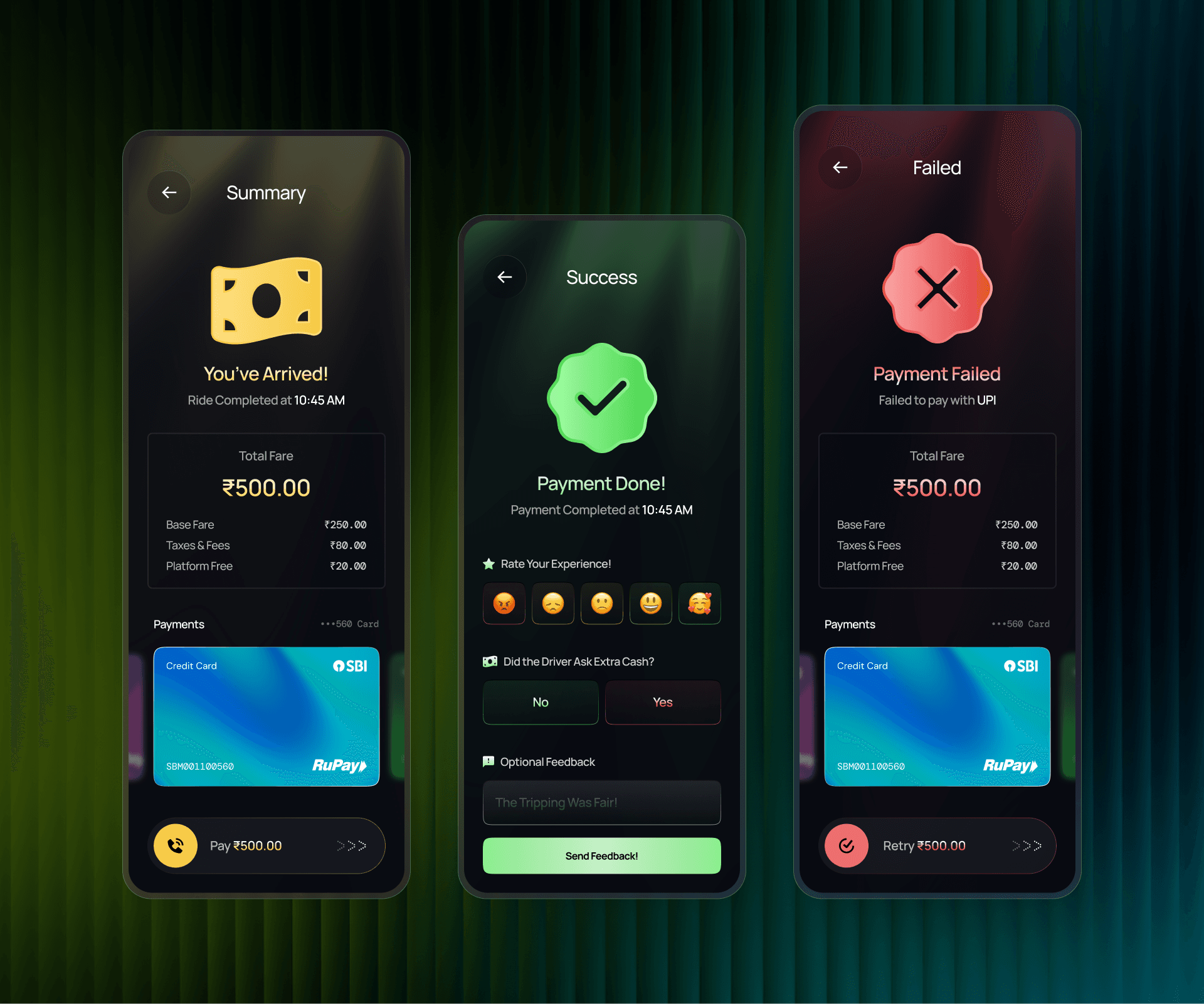
Trip Summary, Payment Success & Payment Failed Screens
Design Decisions
Small interaction changes, driven by watching real people use it.
None of these were part of the original plan — each came out of a usability round with 31 participants, and each changed how a specific moment in the flow felt.
1. Tap confirmations became slide gestures
Early versions used standard tap buttons for confirming a ride or a driver. Testing surfaced that a tap didn't feel secure enough for an action with a real cost attached. Switching to slide-to-confirm added a small deliberate step that made the action feel intentional — and improved the visual polish of those screens as a side effect.
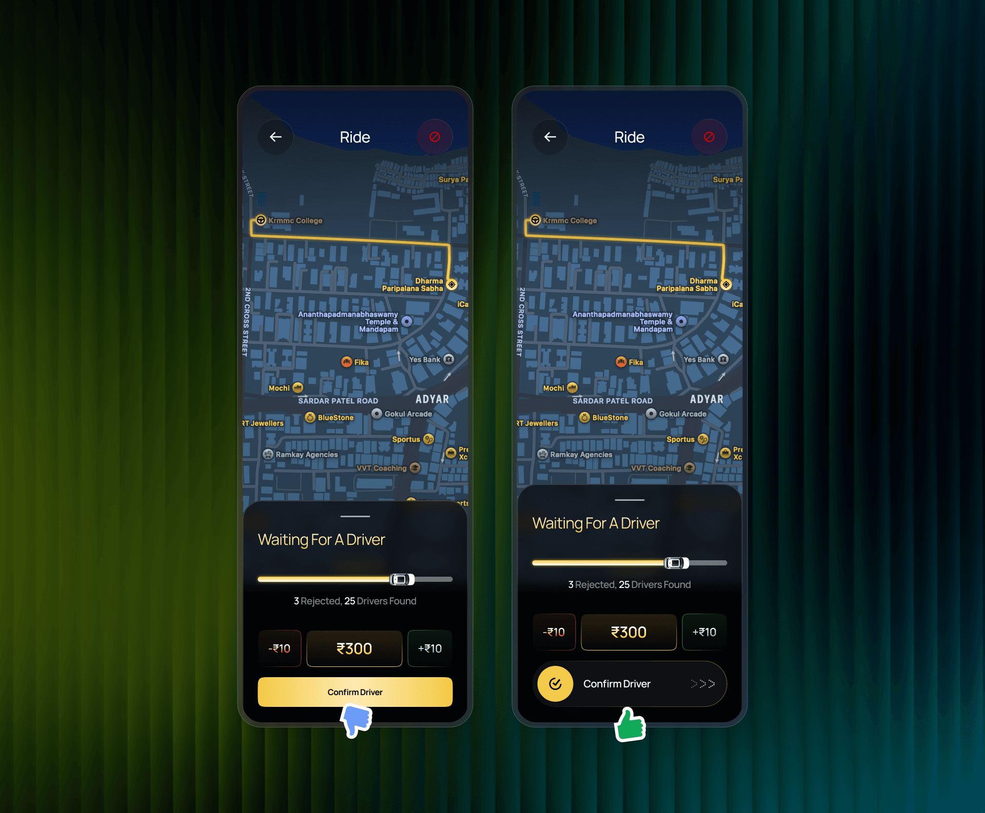
Before (static tap) vs. after (slide-to-confirm)
2. Live tracking needed a face, not just data
The first tracking screen represented the driver's car as text only. In testing, this read as cold and hard to parse at a glance. Adding an illustrated top-down vehicle, matched to the driver's actual vehicle type, gave riders an immediate, intuitive sense of "where's my ride" — one of the most positively received changes in testing.
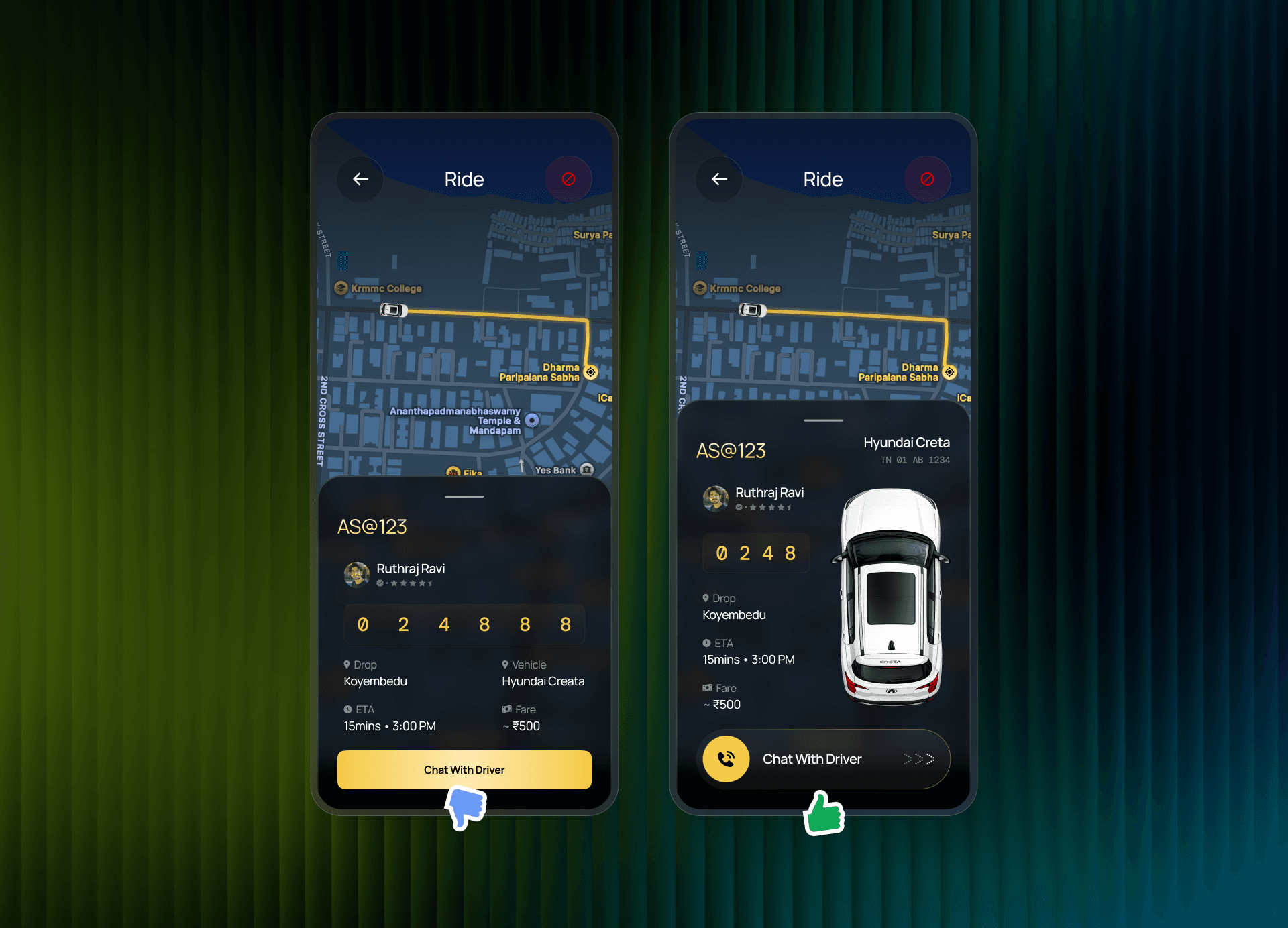
Before (text-only) vs. after (illustrated vehicle)
3. Reachability shapes behavior
A smaller but telling detail: the cancel action was originally easy to reach, which made accidental cancellations common. Deliberately moving it out of easy thumb-reach reduced accidental cancellations without adding any extra confirmation step elsewhere.
Validated by testing
The usability round ran informally through college classmates and staff, using the live Figma prototype directly. 31 people responded, averaging 8.58/10 (range 7–10) across students, teachers, developers, drivers, friends, a UX designer, a PM, a QA tester, and a senior designer.
- Moved the profile button to the top of Home, after a tester couldn't find it
- Raised secondary text opacity from 60% to 80% for readability on the dark theme
- Reduced glow effects on map elements, per repeated feedback
- Illustrated vehicles on the Real-Time Tracking screen, replacing plain text
- Increased the size of the rider-call button after driver-side feedback
- Switched to slide buttons — flagged independently by two different testers
- Added an active-state highlight when selecting a vehicle card
Not every suggestion made it in — a "Share Ride" shortcut was proposed and explicitly rejected by the client, a reminder that testing informs decisions, it doesn't make them automatically.
Visual System
One vehicle set, three angles, kept consistent everywhere.
A small supporting asset system keeps every ride type visually consistent across the app — side, front, and top-down orientations for every vehicle.
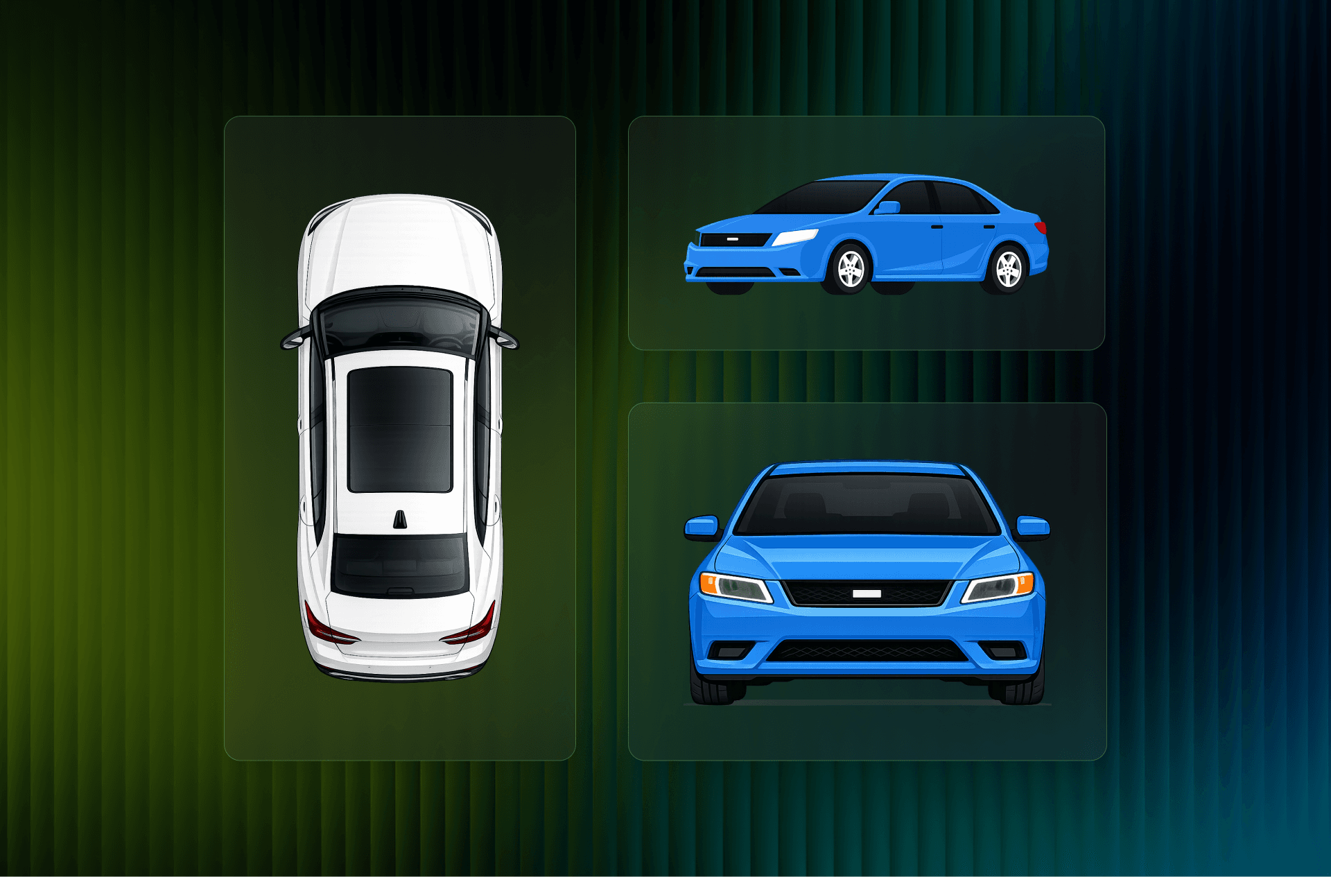
Top, side, and front view vehicle illustrations (Sedan)
Payment Cards
Distinct, recognizable card components for every payment state.
A dedicated visual set for credit/debit cards, wallets, and cash payment options that maintains visual harmony with the dark theme.
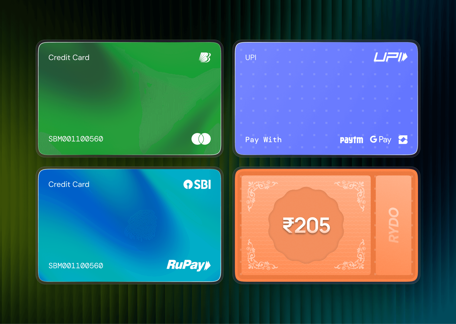
Payment Method Cards — UPI, Credit/Debit Card Variants & Cash on Arrival
Outcome
Approved, and shaped by real usability testing — not assumption.
As this remains a client-owned, unreleased product, hard adoption metrics aren't available to share publicly — but the design was validated directly with test participants before handoff.
- 31-response usability round (8.58/10 average) directly shaped seven concrete changes, including slide-confirmation and the tracking illustration
- Full flow — onboarding through settings — delivered as a handoff-ready Figma file
- Supporting vehicle and payment-card asset system delivered alongside the core flow
What I'd explore next
The usability round that shaped these decisions was informal and single-round. Given more time, I'd want to validate the live-bidding flow at scale — specifically whether drivers actually feel more in control of matching once real earnings are on the line, not just in a test setting.
Personal reflection
This project taught me how to work with an unclear, non-technical client — and how much fallback screens matter when direction keeps shifting. If I started Rydo over today, I'd spend more time understanding the client fully before jumping into hi-fi design; starting early meant adding screens later that broke my own flow. The part I'm proudest of is the onboarding screen, hand-drawn on an iPad. And running the survey myself — going to classmates and staff, handing them the live prototype, and actually collecting their feedback — was the part of this project that made me feel like a professional designer, not just someone making screens.
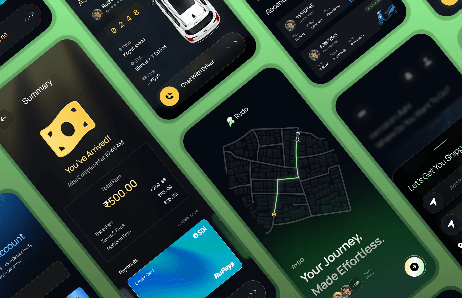
Rydo Final Collage