Take a deep breath. Hold. Exhale. We are about to dive into one of the most important works of mine: Red Analytics. This project presents a comprehensive analysis of the distribution of traffic lights across various states in India. The motivation behind this study is to provide analytical support for my major ongoing project, Tragen.
The project focuses on collecting traffic signal data across the country, with particular attention to accident-prone and high-risk areas. The collected data is analyzed to identify congested and free-flowing zones based on traffic density at signal points. Using geospatial visualization techniques such as heat maps and scatter plots, the analysis highlights congestion hotspots and examines traffic patterns around intersections to better understand peak hours and irregularities.
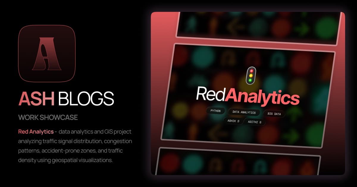
Red Analytics Cover Page
Objectives of the Analysis
The core objectives behind this analytical deep-dive are:
- Collect comprehensive data on traffic lights across India, with special focus on accident-prone and high-risk areas.
- Study traffic density at signal points to identify congested and free-flowing clusters.
- Use geospatial visualization techniques such as heat maps and scatter plots to highlight congestion hotspots and traffic flow patterns.
- Analyze traffic behavior around signalized intersections to identify peak hours and irregular traffic patterns.
- Generate insights that can support better traffic light planning, smarter urban infrastructure, and improved road safety.
Tech Stack
Building a robust analytical pipeline required a blend of data processing and machine learning tools:
- Python: The backbone for data processing using libraries like Pandas, NumPy, and Plotly.
- OpenStreetMap (OSM): Sourced geospatial data using the Overpass API.
- TensorFlow: Utilized for advanced modeling and potential predictive analysis.

Red Analytics Tech Stack
Data Collection
There’s a lot of planning to be done when it comes to an analytics-based project. The most essential component of such projects is accurate data. For this project, I collected geospatial data related to traffic signals from OpenStreetMap using the Overpass API.
The data included the geographic coordinates (latitude and longitude) of traffic signal locations along with relevant metadata such as the type of signal node and its position within the road network. By gathering this information, I mapped the distribution and density of traffic signals across selected regions. The dataset was then stored in a structured GeoJSON format, ensuring it could be easily used for geospatial visualization and smart mobility applications. For a more detailed understanding of the entire process, feel free to check out the official website at redanalytics.com.
Data Collection and GeoJSON
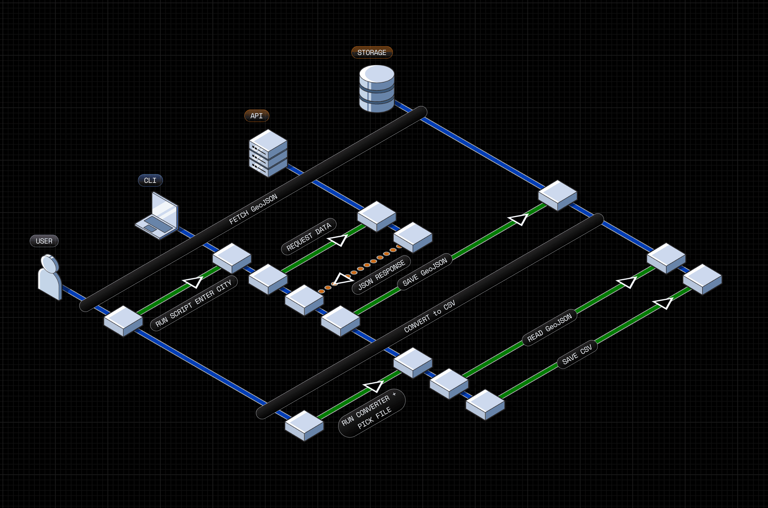
Workflow
The application follows a streamlined process from raw query to final insight:
- Query Input: Entering a city name to fetch data via OSM Overpass API.
- Data Processing: Converting GeoJSON returns into structured CSV format for easier handling.
- Visualization: Pinpointing coordinates on interactive maps.
- Analysis: Presenting spatial distribution using scatter plots, bounding box visualization, and heat maps.

Red Analytics Workflow Diagram
Visualisation Strategies
Visualization transforms tabular CSV data into interactive geographic maps. This provides both micro-level inspection of individual signals and macro-level density analysis. To better understand the data visualization process, visit the Data Visualization section on our website.
Scatterplot
Focuses on plotting individual traffic signals on an interactive city map using Plotly. This helps in getting an accurate spatial distribution of signals across India. The system handles the heavy lifting—loading data, pinpointing locations, and applying suitable styles.
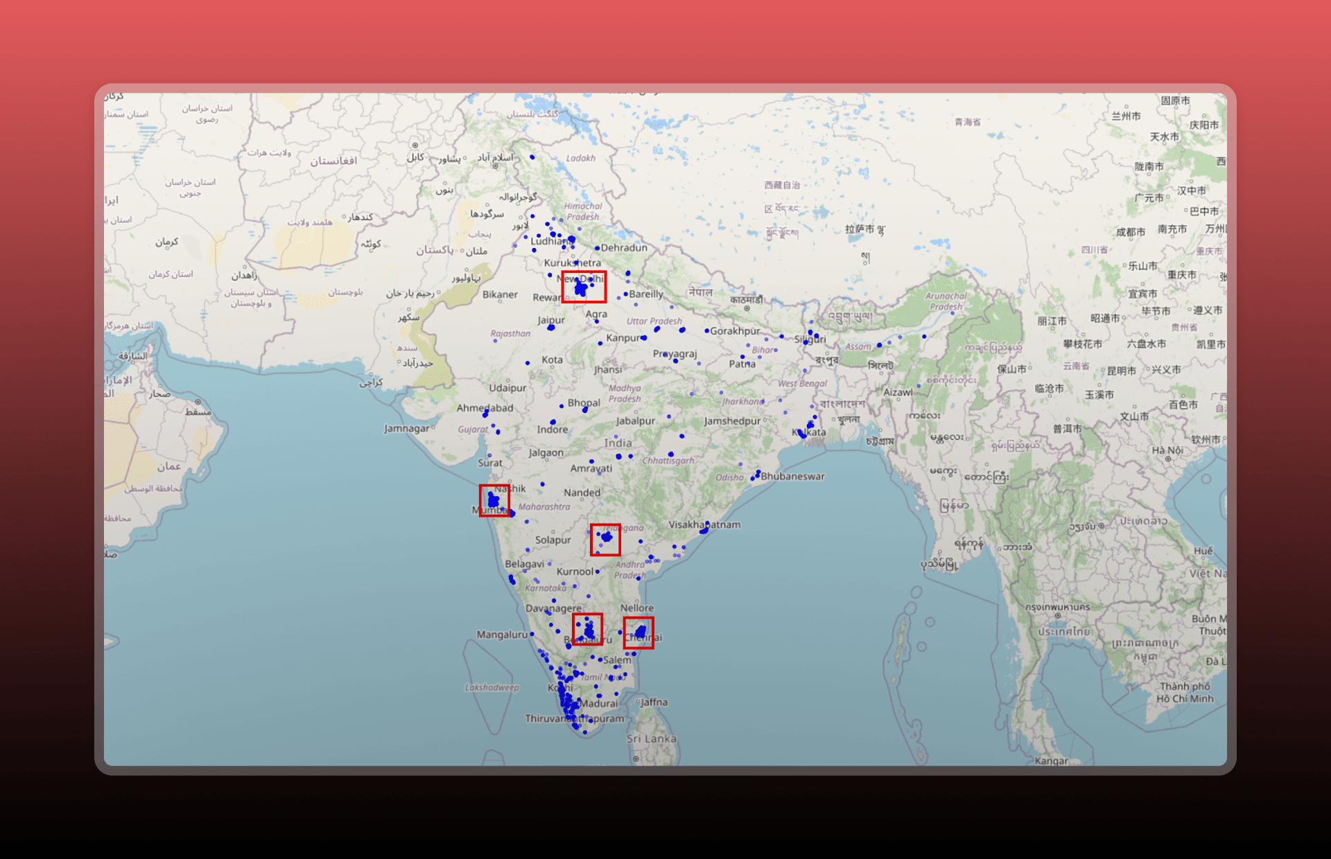
Interactive Scatterplot Map
Heatmap
Since scatterplots can become crowded in dense areas, the heatmap feature captures signal concentration and density clusters. Users can adjust parameters like the radius and opacity to generate tailored density maps.
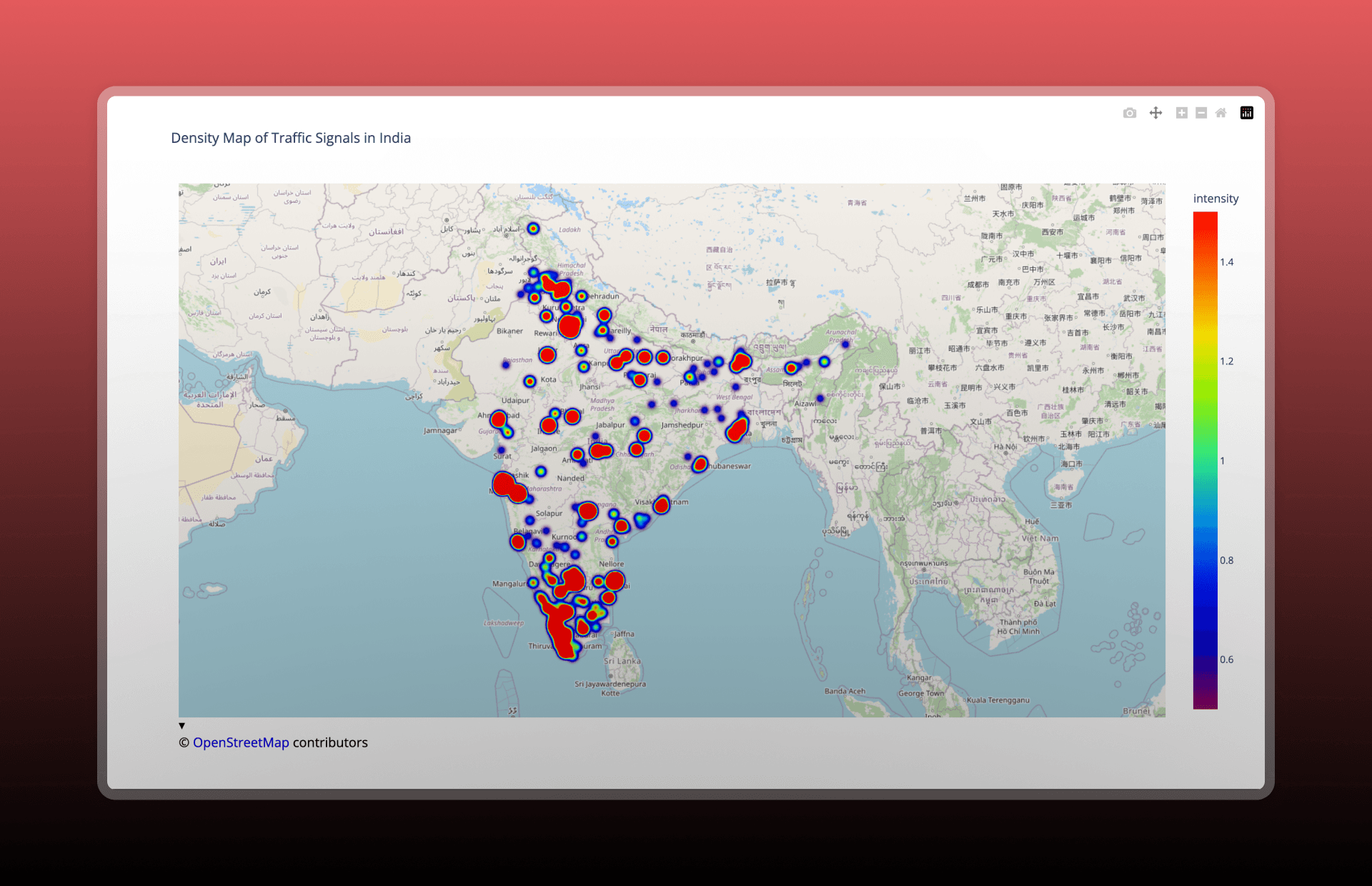
Traffic Signal Density Heatmap
DBSCAN
Implemented to study natural spatial groupings. This algorithm identifies dense intersections while marking isolated signals as noise points, which is crucial for identifying potential traffic bottlenecks.
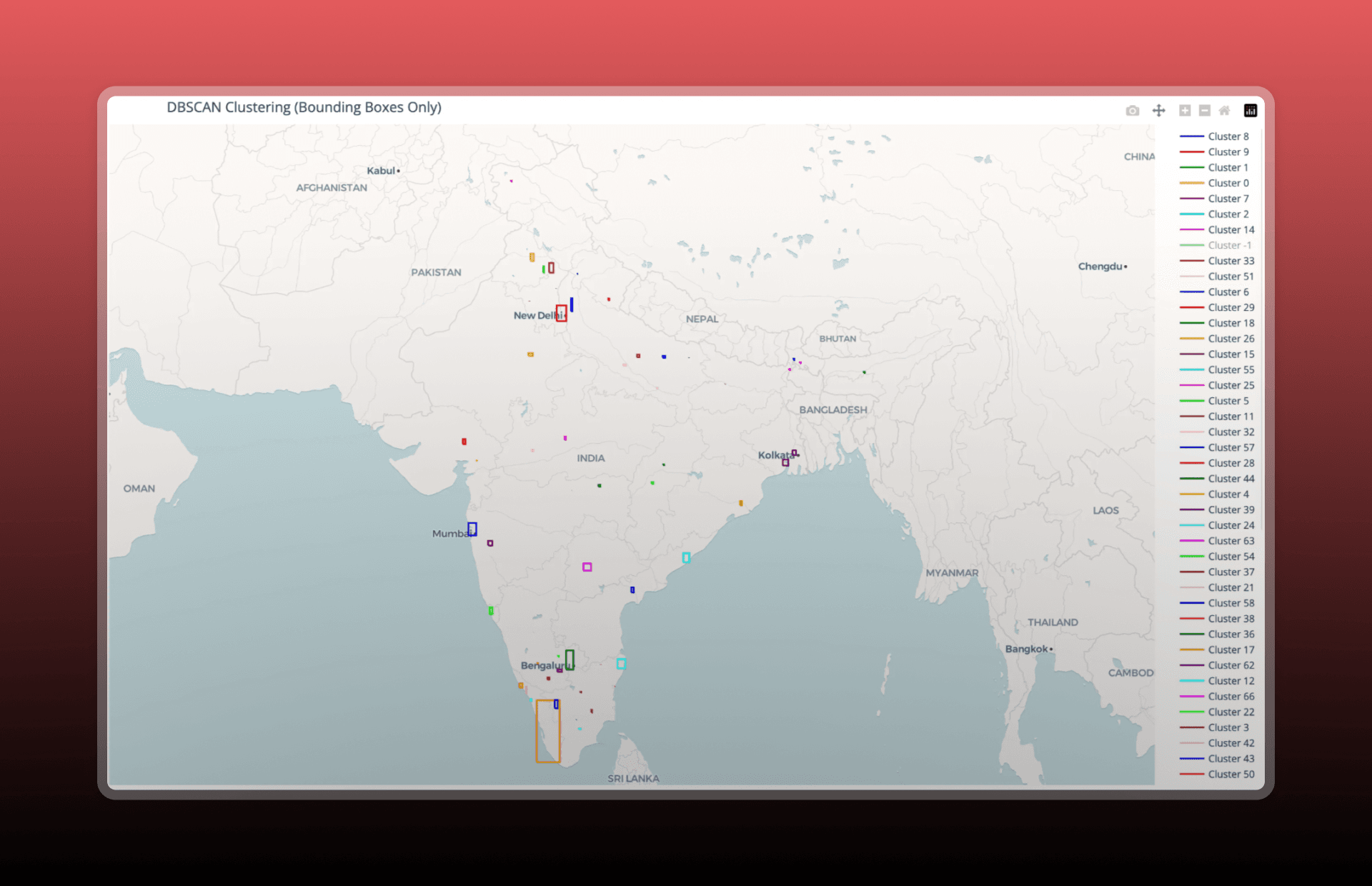
DBSCAN Clustering Visualization
Data Analysis Pipeline
The pipeline begins by applying DBSCAN (Density-Based Spatial Clustering of Applications with Noise) to detect natural spatial groupings. This identifies clusters based on density without needing predefined categories.
After clustering, I generated quantitative summaries such as the largest/smallest clusters and noise points. I also calculated spatial bounding boxes to define the geospatial extent of each cluster, enabling easier comparison of signal-dense regions.
Results Obtained
The analysis reveals that traffic light infrastructure in India is largely urban-centric, with a significant concentration of signals in major cities. Rural and semi-urban regions show limited coverage, indicating infrastructure gaps.
| Region Type | Infrastructure Status | Key Observation |
|---|---|---|
| Major Metros | High Density | Concentrated at commercial hubs |
| South India | Consistently High | Better infrastructural spread |
| Kerala State | Distributed | Even spread across semi-urban areas |
| North India (Rural) | Low/Sparse | Gaps in traffic regulation coverage |
Conclusion
Honestly, I was a bit overwhelmed at the beginning because Red Analytics requires significant information gathering and efficient decision making. Through this two-month journey, I gained valuable insight into the current traffic signal distribution in our country, which will directly contribute to Tragen.
While the task of mapping a nation's infrastructure was tedious, the knowledge gained in spatial analysis and urban planning is invaluable. To know more about this project, please visit the official website. That’s all folks! Looking forward to working on more projects like this!
Red Analytics Cover Iamge